And so, today I want to describe the development of a landing page. The way it works for me.
The brief
The work begins with a study of the brief. I have it drafted in a way that closes all the basic questions needed to start the work.
Some customers think that the brief is either a formality or unnecessary bureaucracy. And approach it as a formality. In fact, every question is extremely important to me. Therefore, if the brief is not filled out completely, I have to correspond more with the customer to find out the missing details.
Competitors
After reviewing the brief, I start looking at competitors’ sites. Analyze them in terms of design, presentation of information, usability, etc. If I am familiar with the niche superficially, I try to study the subject deeper. It is necessary to understand how to present information taking into account the niche and the target audience.
The text
Without a ready-made text to work on a one-page can not. And often, even in the finished text you have to make changes as you work on the site.
This happens because not every copywriter, provides for all the nuances. For example, the bullet points on the volume of text should be about the same. The block “facts” should be concise.
Design
Next, the references and color palette are selected. Then we decide on the stylistics. Fonts are chosen and the appearance of UI elements.
And only after all this, we start working on the design in the program Figma. It can take place in two ways.
First. From top to bottom. This is when the design is rendered on-screen, starting with the header. That is, first carefully thought out and drawn one screen, then the next, and so on.
The second. From a larger to a smaller. In this case, the largest elements and text blocks are thrown over the entire banding first. This background, headings, buttons. We’re going from more to less, adding more and more detail. In this case, we see at once, as it will look like a landing page. It turns out at first, a kind of prototype (wireframe), where we can clearly see how the site will be easy to perceive by visitors.
At the end, a bonus, I always draw a favicon for the site. This is a small icon in a browser tab.
Adaptive
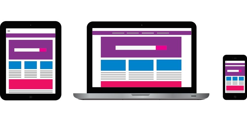
When the design is finished in the main size, work begins on the adaptive. Rendered it is also on the principle of “from more to less. At this stage, you need to think about how each element will look on a small screen smartphone and tablet. Provide for what will happen to the text. How it will change size, indentation, and so on.
If there is an anchor menu on the landing, be sure to think through and change it. Will it be minimized in a burger button, or should it be removed altogether.
Layout
After the design for all the basic permissions is finished, the landing page is made up. We do not make the HTML version, and immediately pull the site on the engine (in our case WordPress). In this case, the customer will be able to independently change the texts and images on the site, if necessary.
Optimization and customization
During the layout takes into account all the nuances. Prescribed all the Title and Description, titles are made in tags H1-H3, a microdistribution.
After the layout is carried out basic setup and SEO optimization of the landing. A robots.txt file is created, xml sitemap. Set the counter statistics.
Of course nobody will give you a guarantee that free traffic to your one-page site will flow like a river, but believe me, SEO is paying off.
Even if not immediately, but say, a few months, there is a chance that the site (thanks to the literate text and proper optimization) will rise in SERP. This means it will be stable, and most importantly free to bring you more visitors.
Thus, the landing is thoughtful in structure, technically properly configured and easy to use.
I’m by no means against designers. It’s just not our approach. And what to choose as a tool – it’s up to you to decide.


