


I am engaged in the development of adaptive websites for more than 6 years. During this time I managed to create a huge number of websites and other graphic works. I spend a lot of time on self-education. In the past I was a retoucher photographer.


There are numerous web designs and opinions on what a perfect website should look like. The many differentiations arise from the fact that design is subjective; hence what one person likes is hideous to another. Many people can judge a company’s credibility from its web design. As a result, this impacts conversions, bounce rates and […]
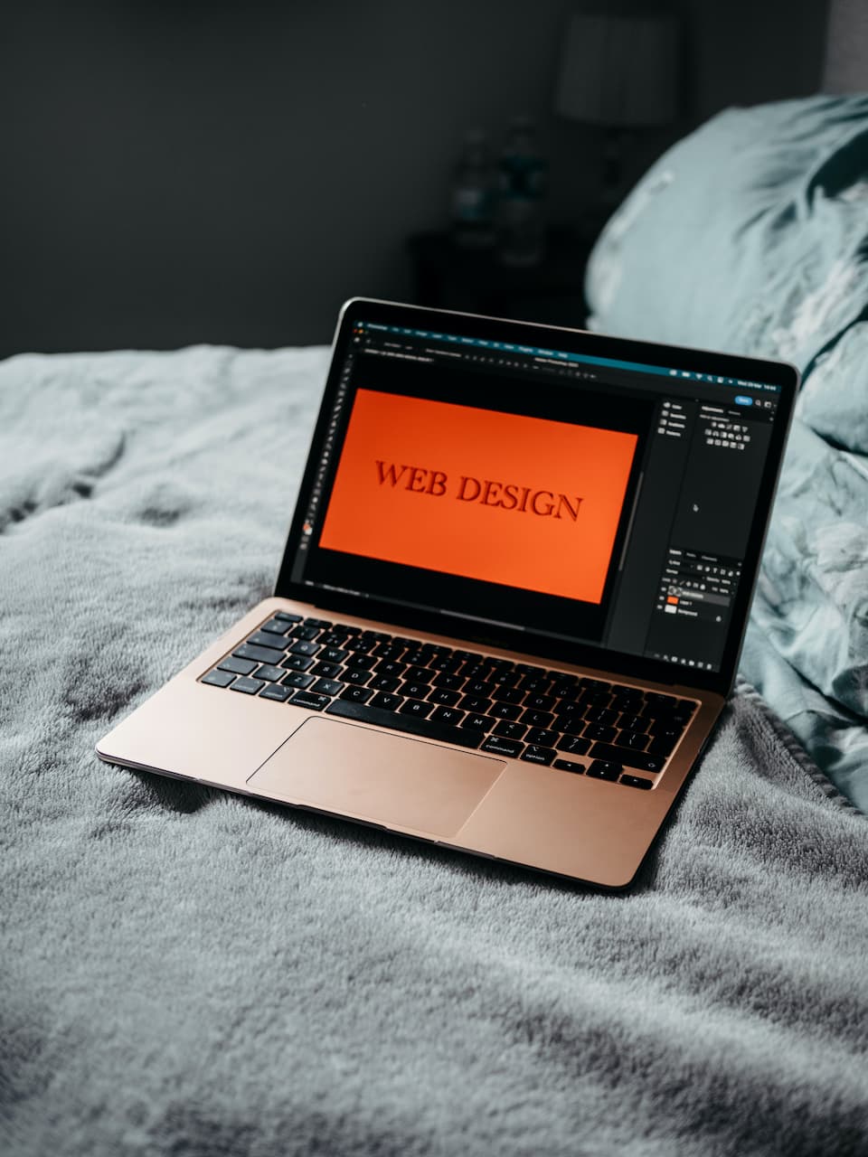
Web design is an art, but it takes a lot of tools to achieve that great look. Web design software is undoubtedly at the core of any website development project. You probably need some web design software if you need to create, edit, or publish static or interactive websites. There are so many different web […]
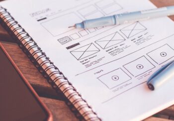
Today let’s talk about the foundation of your websites. The part that is not immediately apparent to the visitor. But in fact, is an important part of any page.
Read More..These days, it’s hard to impress anyone with interface animation. It shows the interaction between screens, explains how to use the application, or simply directs the user’s attention.
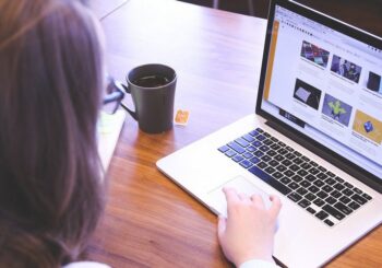
Read More..Have you noticed that the demand for freelance services has increased noticeably these days? And even large companies began to involve more often in their projects not web-studios, and private specialists remotely.
Read More..Free online tools are the norm for today’s web designers. Why reinvent the wheel when you can save time by using free online services?
Read More..Most web agencies and freelancers, in the list of services listed only 3-5 types of sites. Landing pages, business cards, corporate, online stores, and maybe a couple more.
Read More..


Welcome to the web design blog called Corlan. As you have already understood it is not chosen by chance - our project is for all those who, like us, have a soft spot for web design of various Internet projects and sites. But it might as well be useful to anyone who just works or just enjoys designing websites, trying to make their blogs better or just looking for inspiration. We have all that (and much more)!